How to Build a Brand That Makes Sense
You Googled “Free Logo” ….Now What?
Most small businesses start with an idea, a name, a logo, and the need to make it visible. That’s why “free logo design” and “free logo maker” are some of the first things people search for. You need something to put on a website. Something for a profile picture. Something to send with an invoice. So you pick a font, choose a color, download a file, and move on. That works to get started, but a logo is only one piece. A Brand Strategy connects your visuals, voice, and ideas into something you can build from.
Here’s what it covers:
The colors and fonts you keep returning to
The tone your writing naturally falls into
The ideas and values your business keeps circling
The impression you’re shaping through what you put out
The kinds of things you talk about and the kinds you don’t
The way your choices start lining up over time
Free logos give you something to start with. Brand strategy is what makes the rest of it make sense.
What Is Branding, Really?
The first questions are almost always marketing questions: how to get attention, what to post, what to say, how to promote. But marketing only works when there’s something solid underneath it. That’s where branding comes in. Marketing strategy is how your business reaches people. Brand Strategy is what people are actually meeting when it does. When branding is simple, things make sense faster and stick around longer.
Keys to keeping it simple:
One clear idea your business keeps returning to
A defined, consistent visual language instead of endless styles from the internet
A recognizable way of sounding in your writing and messages
Patterns people can notice and learn without being taught
Decisions that come from the same place every time
Defining your brand is something you can absolutely start on your own. Most people do. But it tends to get complicated faster than expected, because the real work starts when you have to write it down and start building everything from it.
Read More → Branding Looks Simple
Colors For Your Brand
It starts small. A new color here. A brighter version there. Maybe a bold accent for a post. Something that “pops.” You’re experimenting. Making things on the fly. Using what’s available. Over time, that freedom starts to show on your posts, your pages, your documents. And not always in a good way. You introduce lime green in two ads. You swap the blue for something brighter on a graphic. You add a new shade because it felt right that day. Nothing is wrong. But nothing matches, and no one can quite recognize you.
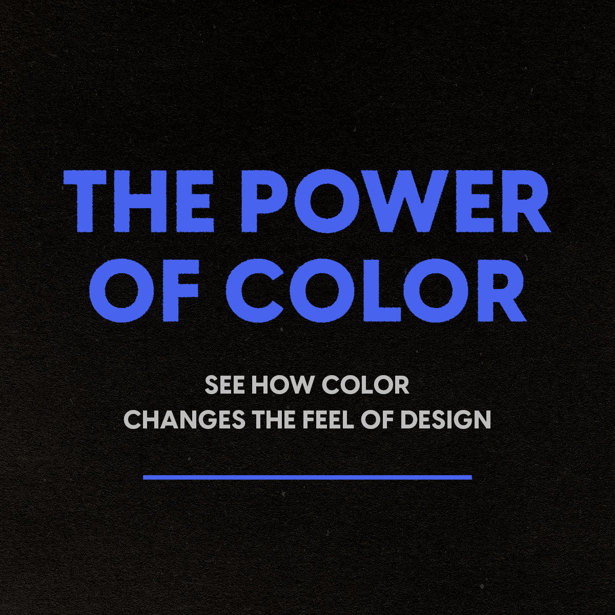
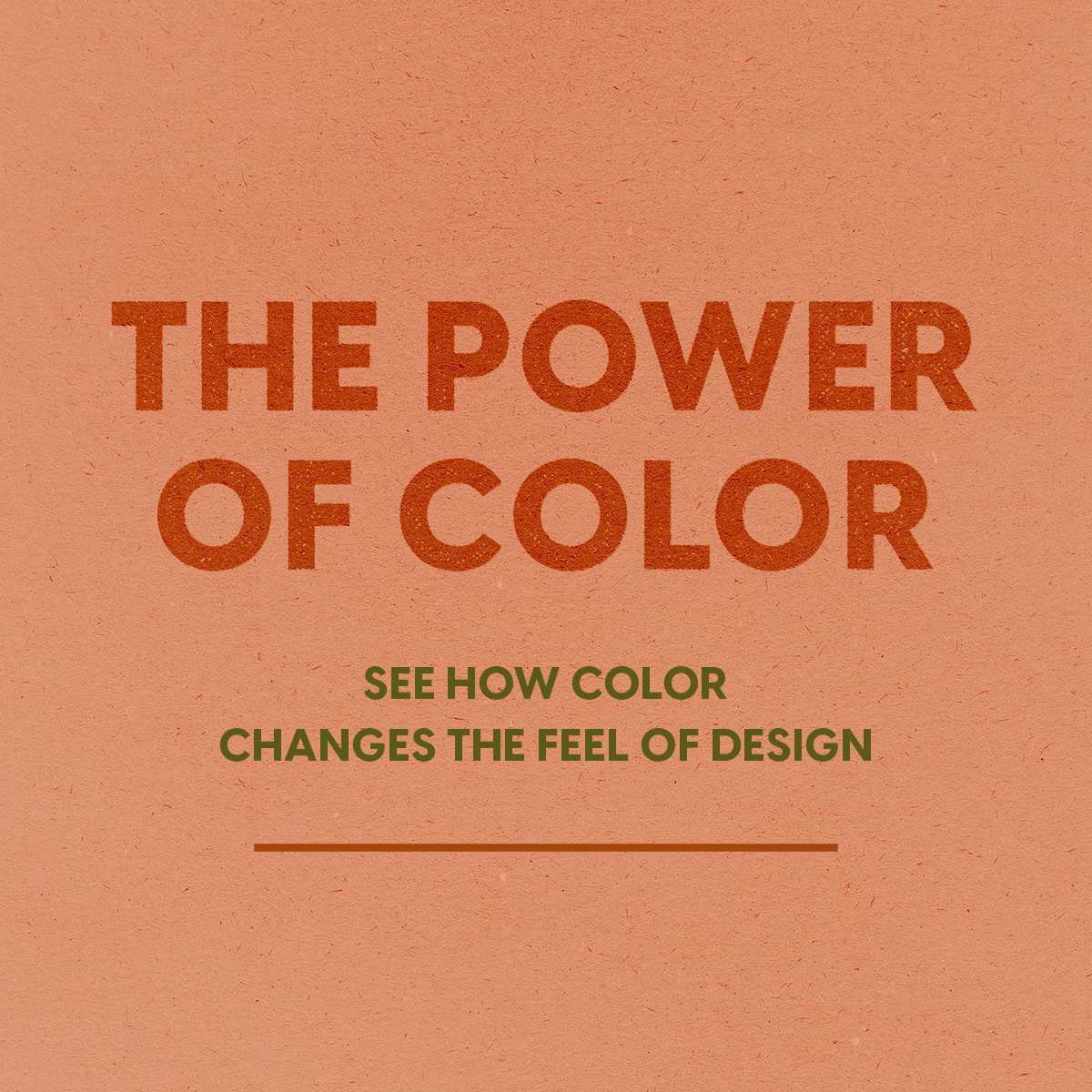
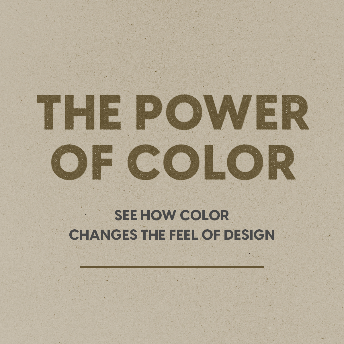
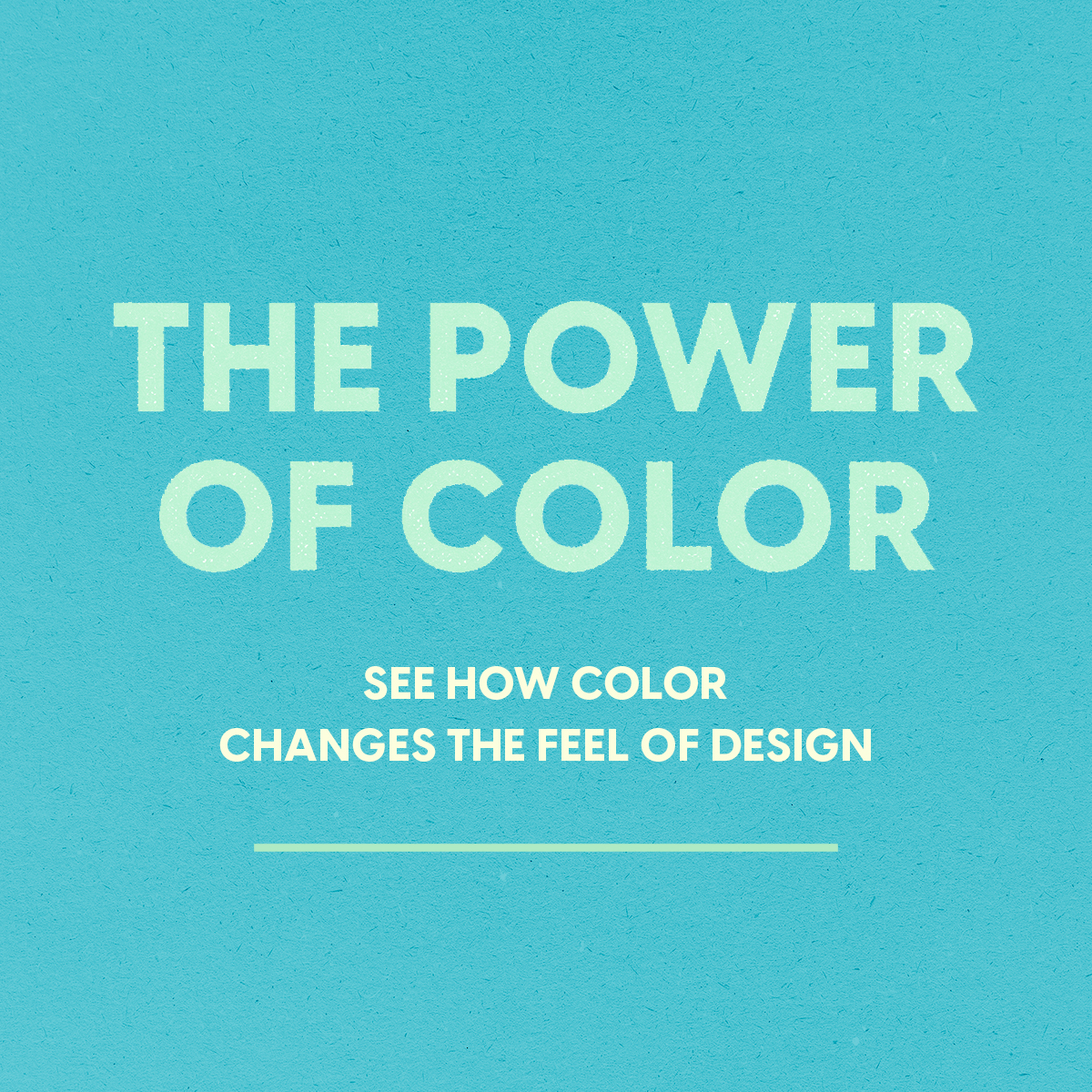
If you’re trying to figure out colors for your brand, what you’re really looking for is a way to make your choices clearer and more consistent. There aren’t universal “best brand colors for small business,” but there are colors that make sense for what you’re building and colors that don’t. When your colors are defined, your materials begin to line up. Your business becomes easier to read. And what started as scattered ideas turns into a system people can recognize.
Font Pairings For Your Brand
Fonts shape the vibe more than almost anything else. You can change the same words into something playful, serious, nostalgic, technical, or luxury just by changing the type. That’s why font choices tend to feel personal. And because fonts do so much perceptual work, they quietly give your brand its voice. They influence how your message is read, how your business feels, and what kind of presence it carries before anyone processes the words themselves.
Where color sets the mood, type sets the personality.
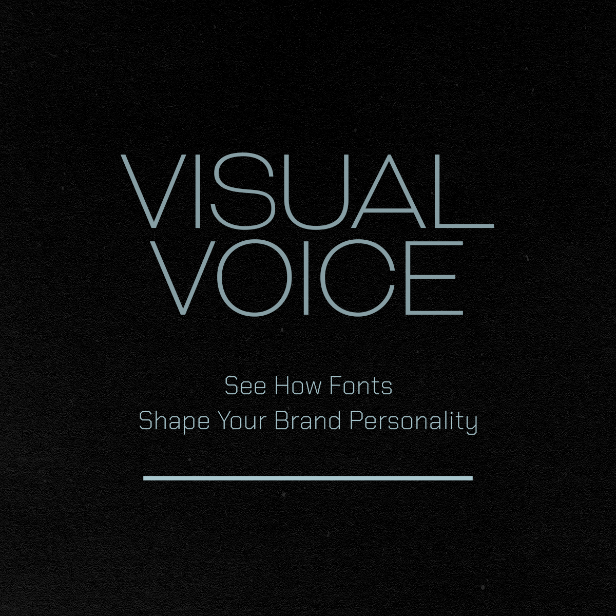
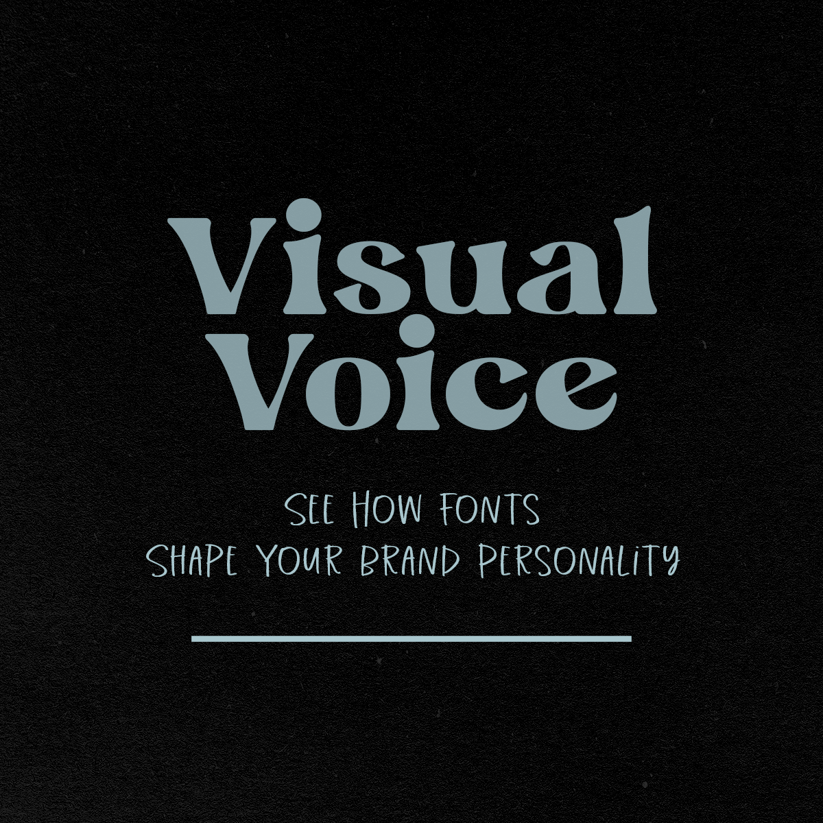
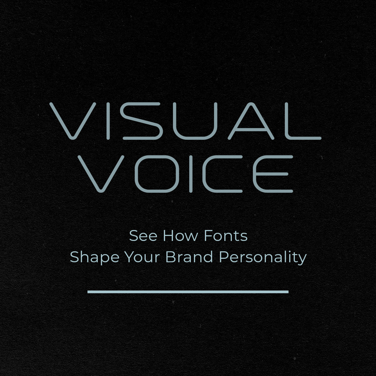
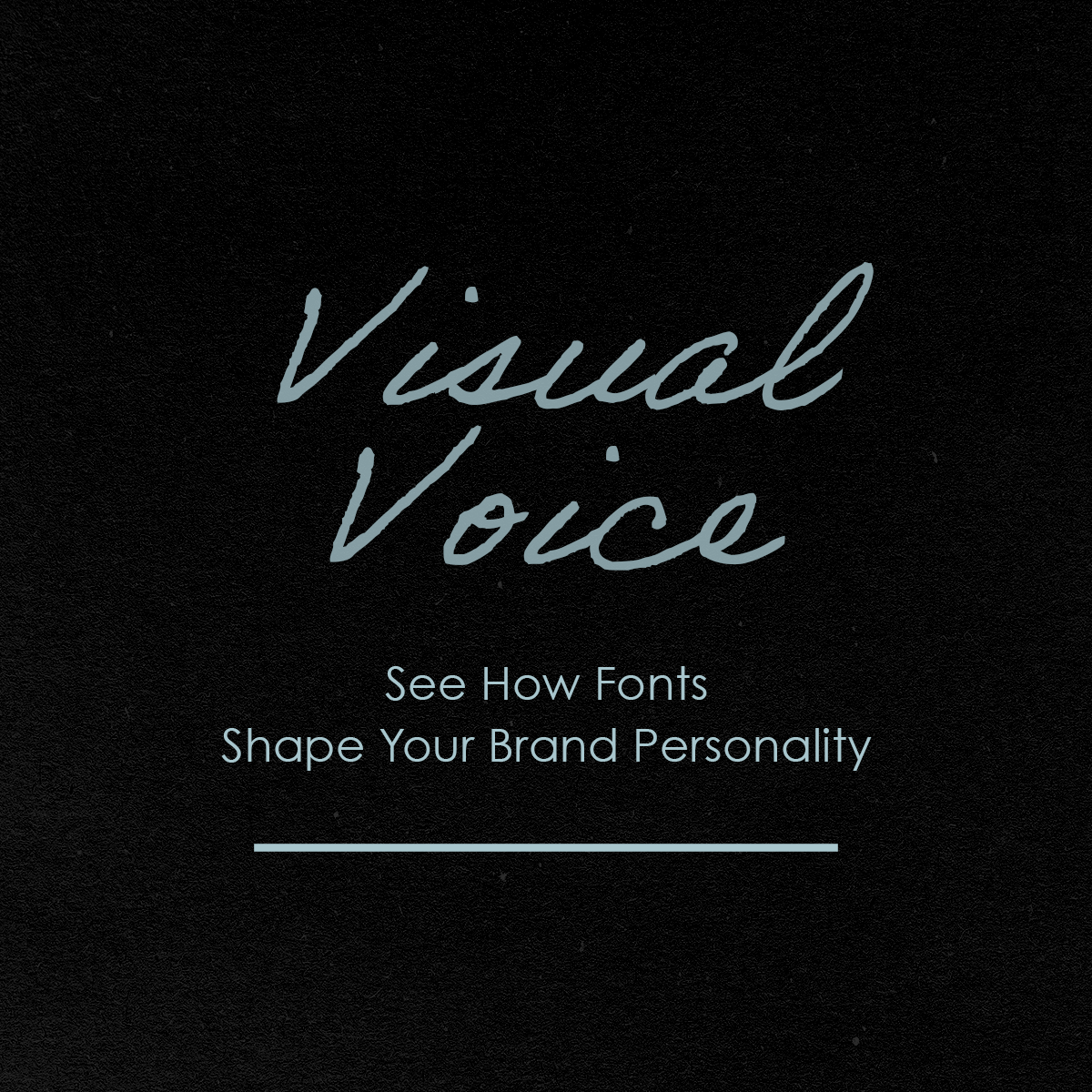
Font pairings are part of how your brand finds its voice. When your brand fonts are defined and repeated, your writing carries the same tone everywhere it appears. Your materials line up more easily, and what you’re building starts to feel more professional as a whole.
What You Have Might Already Be Working
You already know marketing works better when it looks good. What usually gets missed is that it only works when it looks good consistently. You’re putting together posts, pages, graphics, and names that make sense together. The choices you repeat aren’t accidents. They’re the early shape of a system. When you take the time to define it, your work starts to make sense on purpose. And once that happens, you have a functioning brand, something people can recognize and return to.
Not everyone is at that stage yet. This only works when there’s something real to build from, some instinct or pattern already trying to form. A simple way to tell is to look for what keeps repeating.
Things to notice when you’re creating:
Colors you keep reaching for, even when you try to branch out
Fonts that feel easier to use or show up more than once
Layouts you naturally rebuild across posts or pages
Phrases that feel more “like you” than the rest
Pieces you reuse because they already seem to work
Things you keep deleting because they never quite fit
Those repetitions are doing more than saving you time. They’re showing you what belongs together. If you see nothing repeating at all, you’re probably still collecting. If everything could belong to anyone, you might still be echoing. But if you can spot even a few real patterns, you’re not starting from nothing. That’s where brand strategy actually begins: with noticing what’s already there.
If You Want Everything To Make Sense
At this stage, most brands are ready for structure. A defined setup that can guide decisions, visuals, and future work. At Relative Media, we define what your brand is and how it’s meant to be understood, give it a visible form people can recognize, and carry that structure into the materials your business can use. It’s the point where what’s been living in your head becomes something your brand can operate from day after day.
Discover → Branding Services At Relative Media